Programming is one of our shiniest jewels at Mindful Coding Solutions. If you’re a web developer, you should want to show off your finished product to potential clients so they can see what great work you do. In today’s web design standards, it’s usually a “mobile-first” situation, which means web designers will build their websites for viewing on mobile phones and tablets before designing them for desktop computers. A great website will look amazing and be completely functional on any viewport size, whether it be desktop, tablet, or mobile phone. A design portfolio should show what your website looks like on several viewports, to show your client that it will look great no matter where their customers are viewing it. So, you need to provide them some screenshots.
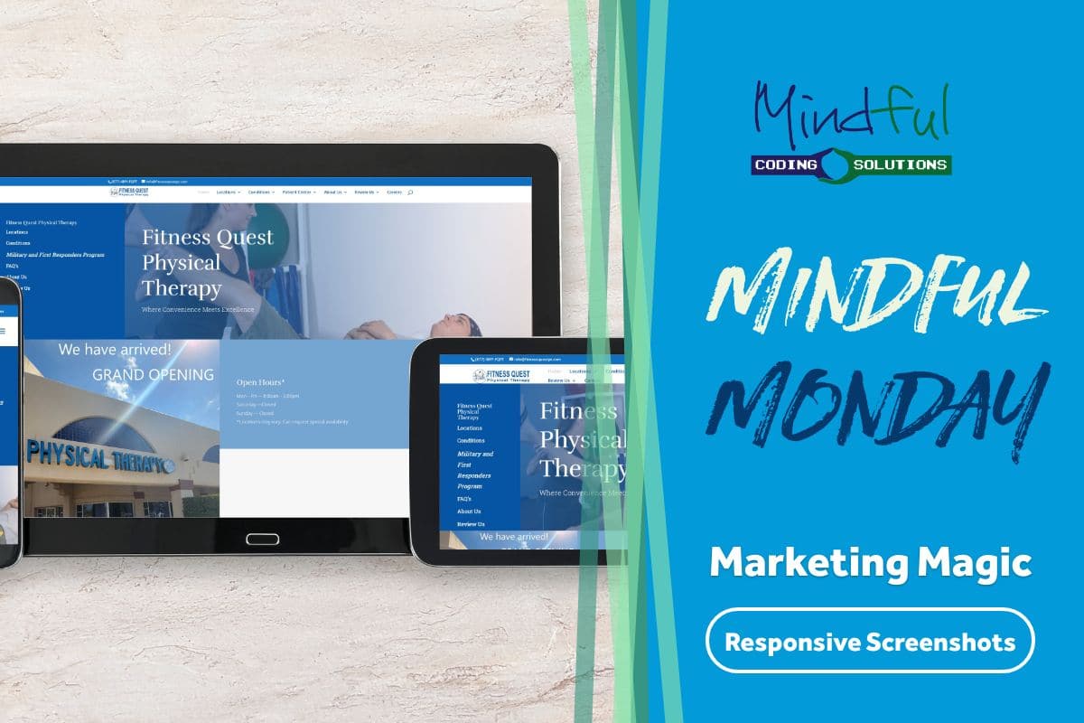
In this first iteration of Mindful Monday Marketing Magic, we will take a look at how we generated a screenshot that shows all three of the important viewport sizes, while taking a lot of the manual copy and pasting and Photoshop that one usually has to do completely out of the picture (pun intended). This kind of programming expertise is one of the many great services offered by Mindful Coding Solutions.
Before Programming – The Container
So we could just throw all three screenshots in an image, but it would look much nicer with a styled container, so we found a image at Dreamstime that already had our three viewport concept.
The Screenshots
Next, we wanted to use a program to take the screenshots we needed, in the exact dimensions we needed to fill those blank spaces in our template. We host a VPS with Scala Hosting that has everything we need to build a new PHP project. Our project uses an open source package built by a Belgian developer called Browsershot, which also has a prerequisite of another server component called Puppeteer. Our programming challenge is to figure out how to calculate all the different cuts of images we need using the PHP GD Image Library.
The program’s functions execute in the following order:
- Grab the first screenshot for the desktop version (1920×1300)
- Grab the second screenshot for the tablet version (1024×768)
- Grab the third screenshot for the mobile version (376×667)
- Assemble the screenshots on our template space
- Merge them with the template (with transparency intact)
The Magic code
The last step of the process is one of the most important.
function imagecopymerge_alpha($dst_im, $src_im, $dst_x, $dst_y, $src_x, $src_y, $src_w, $src_h, $pct){
	$w = imagesx($src_im);
	$h = imagesy($src_im);

	// creating a cut resource
	$cut = imagecreatetruecolor($src_w, $src_h);

	// copying that section of the background to the cut
	imagecopy($cut, $dst_im, 0, 0, $dst_x, $dst_y, $src_w, $src_h);

	// placing the watermark now
	imagecopy($cut, $src_im, 0, 0, $src_x, $src_y, $src_w, $src_h);
	imagecopymerge($dst_im, $cut, $dst_x, $dst_y, $src_x, $src_y, $src_w, $src_h, $pct);
}
After assembling our 3 screenshots and using the “magic code” to merge them with the alpha layer intact. Below is our finished image.

To make it work without editing the code every time we wanted to generate a new set of screenshots for another website, we built a query string that includes the URL we want to pull. And for extra security, we added a static API key parameter that allows only people with a specific alphanumeric code to run our program. It’s isn’t likely that people will find where our public script lives, but that parameter is there just in case.
After reading all of this, you might be thinking to yourself “why would I need this in my business”. Our point it that If you’ve got a business need and can’t quite find an available solution, it might be time to start thinking about a custom-built programming solution. You can reach out to us with your requirements by using our contact form.


